Practice, practice, practice. I wrote this as much to reflect on what I had been considering and to cement my own learning as to share and educate, hopefully you find some value in it. I’ve spent many hours considering my philosophy towards wedding photography, often getting lost along the way before finding clarity. The basics and fundamentals of storytelling will always remain the same, whether shooting black and white or colour, master these and you can produce amazing wedding photography. Let’s get started:
Composition
noun
1. 1.
the nature of something’s ingredients or constituents; the way in which a whole or mixture is made up.
Composition is something of a beast. There are many rules and considerations when framing an image. The size of the canvas, the subject matter, the colours. The list is endless. Each individual element can have an impact on the image and it’s rhythm, and sometimes, the intention is to deliberately break the rules for artistic or conceptual reasons.
The intention of this article is to introduce and for you to experiment with a few more composition tools that should hopefully lead to mastery.
Consider the language you speak, you can only read this article because you know the language. When you speak, you do not consciously reach for words one by one, they come to you naturally. With enough practice these tools and techniques should hopefully enable you to do the equivalent with your image making.
When you raise the camera to your eye, you do not actively think of a technique, your subconscious recognises the scenario playing out in front of you and you naturally employ those techniques. This however, cannot be achieved without practice, discipline and honesty. Sometimes your images are crap, but to learn you must understand why.
You will never improve if you don’t critique your own work. Be brutally honest and pull your images apart. For those starting out I would recommend you learn from a master on the job. Couples ask me should they hire a second photographer, I often lean towards yes, telling them that I only hire established professionals. It’s a tough world out there, and everyone has to start somewhere, I started my career working for free, it’s up to you how you start your journey, do what you need to do in order to learn and improve.
So here we go, the rules of composition.
Play with these rules, insert them into your workflow and see how it affects your wedding photographs. Enjoy making work and enjoy the journey, we are all students of wedding photography and should always strive to learn more and develop our practice no matter how difficult it may be.
You will probably notice that there are areas of overlap throughout this. That’s a good thing. Composition is intertwined, interlinked. separating each individual element is troublesome, but it emphasises why practice is incredibly important. The more you practice and actively critique composition, the more the rules will begin to merge and you will see how some compliment each other more than others to make more sophisticated compositions.
Rule of thirds
You’ve no doubt heard it before, but what the hell is it and why would you use it?
The rule of thirds is a grid that breaks your image up into thirds.
It looks like this:

1) by placing the key part of the image either along either one of the two vertical or horizontal lines will make the image more aesthetically pleasing.


2) by placing the key part of the image inside one of the blocks it will become more aesthetically pleasing.

3) by placing the key part of the image at a point where the lines intersect it will become more aesthetically pleasing.

Does it work?
The short answer is no. You cannot simply place an object along a line or on a point and expect it to be good. There are other factors that must be considered.
The rule of thirds attempts to take the incredibly complex subject of composition and break it down into more basic principles, which only serves to introduce you to the subject. Beyond that, we have to look at composition in more depth and explore the rule of thirds relationships with other rules in order to make sense of it.
Do not hate the rule of thirds. It serves a purpose.
An analogy of this could be the complex world of cooking. One rule might be that salt and sweet go together. But when you know that rule, you then go on to learn that it can be broken.
You then learn that there’s also sour, savoury and umami. You then go on to learn abut how steaming, frying, baking, roasting, sautéing etc. all affect taste and flavour.
Hopefully you see where I’m going with this.
Rules are one part of a whole. One rule will only work when applied in the correct context. The rule of thirds is one of the first rules you encounter, but the topic is so complex it will take years to master.
Rule of thirds and balance
The rule of thirds is an incredibly simple way to introduce the basic principles of composition.
It attempts to encompass a few key points such as balance, direction and rhythm. One of the most integral is introducing balance.
In placing the focal point in one of the thirds of the image, you create a difference in ratio. 2:1 negative to positive or positive to negative space. This creates a balance between positive and negative space.

This can help to move the eye left to right or right to left from the negative space to the focal point. It can also do the opposite, move the eye from the focal point into the negative space.
2:1 Ratios to balance the composition


If the subject is placed within a single block of the grid, then the ratio is 8:1 negative to positive space. This can create a feeling of isolation, loneliness and oppression.

But it is not so easy, you can’t simply place an object in one of the segments and expect your composition to be amazing.
Take this for example, if we recompose the Mona Lisa, it’s not quite as good…

The other common application of the rule of thirds is to place the object of interest on the point where the third lines intersect.

Why would you do that?
The idea is that the lines naturally create a point of tension where they meet. That is the idea anyway. As we delve into this a bit more, hopefully it will become apparent that in order for a technique to work, multiple other factors have to also be in place. I love wedding photography and it gives me ample opportunity to play with composition to tell stories, once finished, look through the portfolio and you’ll see that the rules, whilst simple on paper, when translated into the real world with multiple subjects, often have to be broken in order to work.
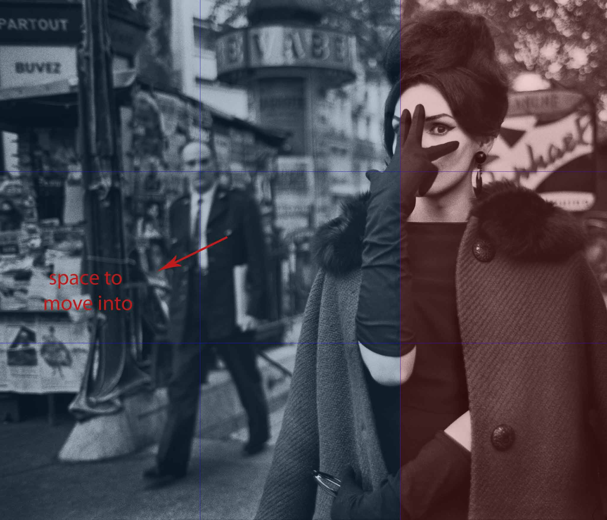
Rule of space or Lead room
This describes a scenario in which the subject is looking into the negative space, it can be used to create a sense of movement as the subject has space to move into. It can also be used to add a sense of optimism – look out towards the future. Tension or a sense of unease can also be created as the subjects gaze can lead the viewers eye out of the frame. Notice the 2:1 ratio is still present.


Placing the negative space in front of the subject can also create a sense of movement and narrative. The subject will inevitably move into that space and reach a destination.
Aspective view
Aspective view or Orthogonal view is the rendering of a three dimensional object in two dimensions or in linear perspective.
Orthogonal; of or involving right angles; at right angles.
This is relevant to you, the photographer, because it allows you to depict objects so that they are easily identifiable to the viewer. invisible rectangles and squares dictates how the subject is viewed. Allow me to explain. A gap in a persons legs as they walk which creates an angle that clearly communicates that this person is in motion. You are taking a three dimensional object (the person) and using angles to create a clear distinction between body parts which makes the persons shape immediately obvious and therefore immediately identifiable as not only a person, but also a person in motion.
Lets inspect this guy:

The clear shape created by his legs is immediately recognisable as a person, but also a person in motion. It adds another layer of information as the plane on which the triangle sits implies the direction he is walking in also. He is two dimensional, but he has been rendered in such a fashion that makes him and his purpose immediately obvious.
Rule of odds
In the words of De La Soul, three is the magic number.
The rule of odds suggests that on a subconscious level, as human animals we find three objects to be harmonious. Squares and regular cuboids suggest stability, whereas a triangle is a dynamic shape as it emphasises directional movement diagonally rather than linearly which in turn creates a sense of movement.
Diagonal movement encourages the eye to move across the entirety of the image, left and right as well as up and down.
The rule of odds would dictate that any odd number of objects would create harmony and balance, however this is subjective and is also informed by other elements of composition. Basically this is one rule to consider and is only one tool in the composition box, to be used in conjunction within others to create dynamic compositions.
In this example the light areas either side help to frame the centre.

Robert Frank: Three key elements of the composition creates a triangle and establishes a relationship between the objects.

Placing three images together can also create harmony by framing the centre image. This is called a triptych (trip-tick)

Exceptions
This is a picture of two Swans. So two things can work in harmony if other ingredients are in place to facilitate it – remember, these are rules, not laws. In this case, notice how the water compliments the shape of the birds and creates a harmony. Much in the same way as the yin and yang symbol does.

Coincidences
Beatboxing. Yes, beatboxing. It’s a brilliant analogy for explaining how coincidences work. The basic beat is laid down, buh tu cah tu buh tu cah. Then new instruments and sounds are added, but your brain keeps the underlying beat going. That’s how coincidences can work. The lines start, form the majority of a shape and then your brain continues following that imaginary line to create the harmony and finish the shape. This creates structure and rhythm across an image without the need for rigid, visible lines.

The foreground
Is the scenery amazing and you just cant take a good picture of it? It seems awkward, unbalanced, something’s just not right. Examine the foreground and see if the objects nearer the camera upset the balance of your image. Understanding how it can add depth to your images can transform a photograph from good to great.
The foreground can lead the eye from the front to the back of the image, balance near and far objects by rendering them similar sizes and can also add much needed context. The foreground can also be used to create a frame within a frame, a much loved technique of Steven Spielberg.
Depth and scale are incredibly important in composition, particularly in landscape photography. An effective use of the foreground can make the image feel like it starts at your feet and draws you into the landscape, taking you on a journey with it. It immerses the viewer in the image. The foreground is like an extended hand, it will hold yours and walk you through the rest of the picture.
Foreground is not always confined to the bottom of the picture, but can form a complete or partial frame of the subject. Doorways, arches, windows. All good foreground frames. A personal favourite is finding the bough of a tree that creates a pleasing arch. The best part of utilising the foreground is that you can use it to hide anything unsightly. Sometimes the light is amazing and the setting ninety percent perfect, there’s just an ugly bastard part of a building in the background.
I have in the past taken a branch and pulled it down (not off, I’m not a monster) and then arched it to hide something hideous in the background. Its simple but effective. If you place an object right in front of the lens then no amount of depth of field will render it sharp so you have to embrace how its shape will move the eye across the picture.

Alignment
A composition tool for a scene that has prominent lines, the aim is to align two or more of these lines with the edge of the frame to emphasise the geometry. As the edge of the frame is a rigid geometric structure, how the photographer chooses to embrace it can have a major effect on the rhythm of the structure contained within it. Shape and form can be emphasised in composition when a structure is aligned with both the horizontal and vertical borders of the image frame. The corners also play a part in this composition technique, they can contribute to the directional flow of the photograph. Angular momentum can be emphasised and can move the eye in a particular direction across the image.

Contrast
Not often considered a tool of composition, but it plays an important role in more complex pieces. Contrast can be utilised in both colour and black and white photography. The difference between light and dark aids the sense of structure, formality and directional flow. Specifically within architecture the dynamic lines are an important feature to emphasise due to the direction and movement along their length and height.
When composing an image of a building the composition becomes pleasing to the eye because it will compare the angle and length. Horizontal lines, for instance, have a more tranquil effect than diagonal lines as they lead the eye in a single direction laterally from left to right. Zig-zags can be exciting, but also disruptive to the flow of an image as it breaks up the natural line that the eye will take. Bold lines can express strength whereas thin, curving lines, suggest delicacy.


Arabesque
“Surface decorations based on rhythmic linear patterns”
Basically swirly patterns that make an image interesting by moving the eye across it. Stems from Arabic patterns, so literally Arab-esque. Adopted as a term in western art during the 1500’s. Imagine how a bird may swoop, climb and dive, it moves from left to right or right to left in a rhythmic fashion, with pauses, changes of direction and elevation, but ultimately moving across the landscape – they take you on a journey with them. That’s what arabesque composition should do for your photographs, move the eye across the image in a rhythmical pattern.
Van Gogh’s Starry Night is a beautiful application of this technique. The clouds allow the eye to gently drift across the image on that same breeze.

Symmetry
Symmetry is fundamentally linked to beauty because of it’s relationship with unity and regularity. Distinct elements within the image are both related to each other and to the whole. The parts of the whole are essentially interchangeable, this creates harmony as each section can be interchanged.

Counterpart
Imagine a set of scales. You place a weight on one side, it lifts the other side up and it becomes unbalanced. You place an object of equal weight on the opposite side, it becomes balanced. That is the fundamental thought process behind the counterpart – when you insert an object, you need another to balance it.
Now imagine a tablecloth on a table. If you pull it in one direction forcefully, the tablecloth comes off, you would need to pull it equally from the opposite direction. Now you have two people pulling equally in opposite directions, and the cloth is stable. An image can pull from all corners. In order to create harmony across the image we need to strategically place elements to make sure that the image pulls equally in all directions.
Take this image from William Eggleston. With all of the elements in place the image pulls equally in all directions.
Remove one of these elements and the image is no longer anchored, the composition is skewed in favour of one side of the picture. You could then say if you were analysing this piece, that the frames in the respective corners act as counterpoints to the cables on the ceiling.
Dynamic composition
Fancy term for using a more complex grid to compose your images. The rule of thirds is a linear grid, it goes up and down, left and right. The intention of dynamic composition is to enable the eye to move both across and up and down the image simultaneously. This creates a rhythm across the image as your eye does not reach the edge of the frame at a ninety degree angle, which would potentially cause the flow of your gaze to stop. Like dropping a ball, it goes in only one direction and will stop in that place. Bounce it at an angle and it moves both up and diagonally at the same time. To calculate how to best use dynamic composition, we need to use what is called an Armature. This is based upon mathematical ratios, if you recoil at the sight of the word ‘maths’ do not fret, you can create the most basic version of it with a ruler, a pencil and a simple connecting of corners and lines. It doesn’t matter the shape of the canvas, draw diagonals in the same fashion as the image below. The diagonal from the bottom left to the top right is called the baroque diagonal. From bottom right to top left is called the sinister diagonal.
The latest version of Photoshop has different crop grids to overlay onto your images so you can try it out with your own pictures.

In this image we have some megalols
The relationship between the lady laughing in the foreground and the background creates a channel in which the diminishing size moves the eye to the right. The croquet stick in the background lines up nicely with the Armature, as does the angle of the models body in the foreground, each element creating a sense of movement from left to right.

Composition with a concept
Composition is not only used to create visually interesting pictures, it can also be used to emphasise a concept, or hide a subliminal message.
10 Pillars of Knowledge: The School of Athens.
The School of Athens by Raphael represents human knowledge. Human knowledge is composed of 10 pillars (parts) that include all the fields that establish our cultural and scientific heritage. Here the image has been composed to deliberately place significant historical figures in positions that represent their philosophical, mathematical and historical views.

To make this image doubly interesting, the composition was as inspiration in Alt-J’s video ‘Tessellate’. Many modern creators and creatives reach back into the archives of art history to recycle old ideas. Next time you’re looking at a painting, why not challenge yourself to think of how you would make it into a wedding portrait?

What is also fascinating is how this relates to capturing images and video, but the same rules apply to layout design and typography. Clients often want to know abut their wedding album design, I apply the same knowledge of composition into that too to tell the best story. All of these are merely tools, ideas for you to play with. Go forth and conquer. Create something that makes you happy.